
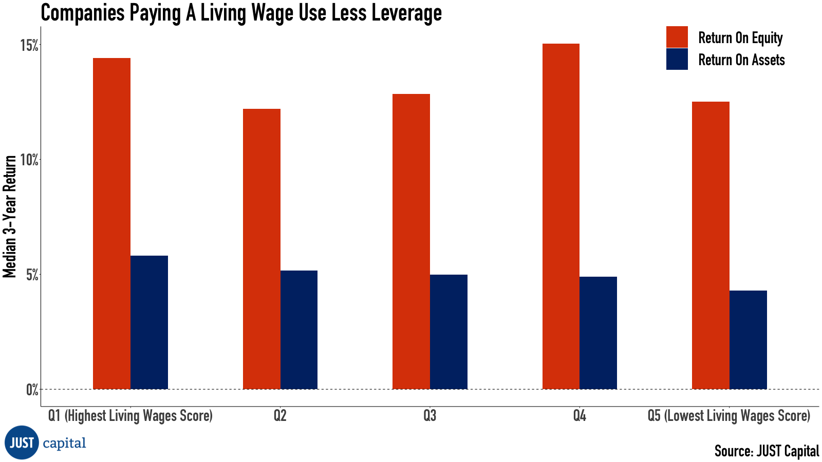
In this week’s Chart of the Week we take a look at the Living Wage Score* across all companies we rank within the Russell 1000 universe, splitting the companies into five quintiles from the highest score to the lowest on an industry-neutral basis.
Our Living Wage Score is based on an estimated percentage of on-site workers making a living wage, which is the level of income needed to meet basic needs, adjusted for location and family size, and not accounting for short- and long-term savings or burdensome expenses like debt.
Looking at the data for the Return on Equity (ROE) across the five quintiles, we see no meaningful trend using the trailing 3-year median. However, there is a trend in Return on Assets (ROA) with companies that we estimate pay more of their workers a living wage outperforming those that don’t.
(JUST Capital)
ROE is an important measure of a company’s financial performance and profitability. It represents how many dollars of net income a company generates in any given year per dollar of equity, and is driven by three main components: operating efficiency, asset efficiency, and financial leverage. The product of the first two is also known as ROA, or the net income per average assets.
Looking at the trend in ROA but not in ROE in the chart above, there is the implication that companies we estimate pay relatively fewer workers a living wage are also companies that take on more financial leverage – and thus more risk – than those that pay more workers a living wage in order to deliver the same level of profitability.
The Good Jobs Institute is one of our partners in the Worker Financial Wellness Initiative we cofounded with PayPal, and it has done extensive research on the benefits of what it calls “The Good Jobs Strategy,” which includes raising wages to avoid any worker struggling to make ends meet. From the WFWI’s guide on how what “worker financial wellness” means and how it can be measured, here’s an overview of a case study on Quest Diagnostics:
“After consolidating 20 call centers into two, Quest Diagnostics experienced 60% turnover, which cost the company $10.5 million each year in direct replacement costs alone. Quest implemented the Good Jobs Strategy by raising wages, creating a more clear career path with incremental pay raises, and improving training. It simultaneously raised expectations of employees, with a more stringent attendance policy and better performance metrics. It improved operations as well, reducing non-value-add call volume and creating ‘model pods’ to drive employee engagement and identify high-leverage improvement opportunities. Within 18 months, turnover rates were cut in half and unplanned absenteeism dropped from 12.4% to 4.2%. Quest’s service improved too: Its 60 second answer rate went from 50% to 70% and call transfer rate from 12% to 9.5%. And they realized $1.3 million in run-rate cost savings from process improvements, many driven by their call center reps.”
Put simply, GJI’s research has found that companies’ investments in living wages and complementary operations improvements drive worker engagement, which in turn drives productivity, and that ultimately creates value for shareholders. It has found that this has worked across different sizes of companies, and across all industries, including ones with notoriously low profit margins, like certain sectors of retail.
If you are interested in supporting our mission, we are happy to discuss data needs, index licensing, and other ways we can partner. Please reach out to our Director of Business Development, Charlie Mahoney, at cmahoney@justcapital.com to discuss how we can create a more JUST economy together.
*Note on the Living Wage Score: Our proprietary living wage model uses geocoded data on a company’s locations across the United States and the number of employees in each of these locations, to which we assign industry classifications (NAICS codes). Using data from the Bureau of Labor Statistics (BLS) on the distribution of occupations (Standard Occupational Classification code) within each industry, we estimate the number of workers in each occupation per location. We then match crowd- sourced wage data to each of these occupations and estimate a wage distribution for each company. Missing wage data for occupations are filled in with national averages from BLS. Finally, using data from our cooperation with MIT’s Living Wage Calculator to determine the national living wage for a family of one full- time worker, one part-time worker, and one child, we determine the share of workers per location who make at least the national living wage.